

Why Etsy Listing Photos Matter
Your Etsy photos perform the work a salesperson would do in a physical shop. They attract attention in search, establish expectations on the listing page, answer practical questions, and reduce uncertainty before a buyer commits. Strong photography cannot rescue an unsuitable product, but weak photography can hide an excellent one. Optimizing your images therefore means making the item easy to notice, understand, trust, and imagine using.
The main image deserves priority because it usually appears in search results, category pages, recommendations, and shared links. Its job is not to explain every detail. Its job is to earn the click by presenting one clear, appealing view of the exact product. Additional images then supply evidence: scale, texture, dimensions, variations, packaging, care information, and real-life use.
A useful goal is consistency between the promise made by the thumbnail and the experience delivered on the listing. If a buyer clicks expecting a large blue ceramic vase but discovers a tiny ornament in a different shade, the mismatch can damage conversion and increase disappointment. Accuracy is persuasive because it builds confidence.
Plan a Photo Set Before Shooting
A deliberate shot list prevents attractive but incomplete galleries. Begin by identifying the questions a cautious buyer might ask. What is included? How large is it? How does it look from the side or back? Is the color distinctive? What does the material feel like? How is it packaged? Which details demonstrate craftsmanship?
Translate those questions into a sequence of images. A versatile set might include a clean hero photograph, an angled view, a close detail, a scale reference, an in-use scene, a variation guide, and packaging or personalization guidance. You do not need to force every category into every listing. Select images according to the product and the decisions buyers must make.

Consider the order carefully. Lead with the strongest overall view. Follow with views that answer the most important objections. Put secondary information later, unless it affects selection, such as color options or size differences. Your gallery should feel like a guided explanation rather than a random collection of photographs.
Review the finished set at thumbnail size. If the product becomes unrecognizable when small, simplify the composition. If two images communicate the same information, replace one with a more useful view. A practical checkpoint is whether someone unfamiliar with the item can summarize its appearance, size, purpose, and options after scanning the gallery. If not, add evidence rather than decorative pictures.
Create a High-Converting Main Image
The first image should make the product immediately identifiable. Use a clear composition, strong focus, and enough contrast between the item and its background. Avoid clutter that competes with the product, including excessive props, busy patterns, unrelated objects, or text that becomes unreadable at small sizes.

A neutral or restrained background often works well because it keeps attention on the item. However, “neutral” does not require pure white. A softly coordinated surface can communicate warmth, handmade character, or a particular aesthetic while preserving clarity. The best background supports the product instead of becoming the subject.
Frame the item with room around its edges, but do not make it so small that the buyer must inspect the image to find it. Check how cropping affects square previews. Important features should not sit close to corners, where platform displays or mobile layouts may cut them off. Photograph more space than you think you need, then inspect the likely crop.
Show one primary item whenever possible. If the product is sold individually, a group arrangement can mislead viewers about quantity. If a set is sold together, show the complete set clearly and explain what is included elsewhere in the gallery or listing details. Props should provide context, not create ambiguity.
The main image should also match your shop’s visual identity. Similar lighting, framing, and color discipline across listings make the storefront easier to browse. Consistency does not mean every product must look identical; it means buyers can recognize your work quickly while still seeing each item accurately.
Improve Thumbnail Recognition
Shrink the hero image on your computer or phone. Can you identify the product within a second? If the answer is no, move closer, simplify the background, or choose a more distinctive angle. This small test matters because shoppers often scan quickly rather than study every result.
Use Supporting Images to Remove Doubt
Supporting images should answer questions that the first photograph cannot. An angled view reveals depth and construction. A back view shows closures, stitching, mounting hardware, or finishing. A close-up lets buyers judge texture, grain, engraving, brushwork, or other details that justify the price.
Scale is especially important. A product photographed without context can appear larger or smaller than it is. Include a familiar object only when its size is broadly understood, and never rely on the prop alone. State measurements in the listing and, where helpful, show a ruler, hand, model, room setting, or worn example. The photograph and written dimensions should reinforce each other.

Lifestyle photographs help buyers imagine ownership. Show jewelry being worn, art placed in a room, stationery on a desk, clothing on a body, or a kitchen item in an appropriate setting. The scene should demonstrate use while keeping the item visible. Avoid styling that suggests accessories or furniture are included unless the listing makes that clear.
For wearable products, use views that reveal fit, drape, closure, and proportions. Different bodies can produce different impressions, so written measurements remain essential. For home goods, show the item in relation to a surface or room. For digital products, demonstrate the files, interface, or printed result without exposing private information or implying physical contents that are not supplied.
Use a dedicated image for variations when choices are easy to confuse. Label colors, finishes, sizes, or styles plainly, and make the examples large enough to compare. Do not depend on subtle screen differences to communicate color. Describe variation limitations honestly, since lighting, monitors, materials, and production batches can affect appearance.
Photograph Materials, Texture, and Craftsmanship
Buyers of handmade products often want evidence of construction. Lighting from the side can reveal relief, weave, stitching, carving, or surface variation. Diffused light generally reduces harsh glare, while a controlled highlight can help reflective materials appear dimensional. Experiment with position before changing equipment.
Texture photographs must remain truthful. Excessive sharpening, saturation, blur, or filters can create expectations the physical item cannot meet. Capture distinctive irregularities when they are part of the handmade character, but explain whether each mark is normal variation or a possible flaw. Transparency reduces returns and encourages buyers who value individual craftsmanship.
Reflective, translucent, and very dark materials require special care. Reflections can hide form, and shadows can swallow detail. Adjust the position of the light, camera, and product rather than relying only on editing. For glass, polished metal, glossy ceramics, or resin, a larger diffused light source often produces softer reflections. For black products, preserve edge separation with a suitable background and controlled highlights.
Check color under consistent lighting and compare the photograph with the actual item. Avoid colored walls or strong filters that shift the product’s appearance. If exact color is difficult to guarantee, use careful wording in the listing and show multiple views. Never edit images to conceal a meaningful difference.
Improve Lighting and Composition Without Expensive Gear
Good light matters more than expensive equipment. A bright window can provide useful illumination, especially when softened by a sheer curtain. Place the product near the window, turn it gradually, and observe how shadows describe its form. Direct midday sunlight may create harsh contrast; overcast light or diffusion can be easier to manage.
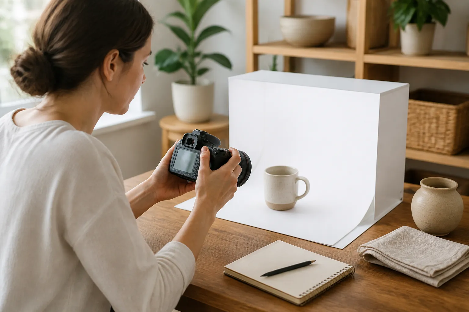
Use a stable support when possible. A tripod, improvised stand, or carefully braced phone reduces blur and makes repeated framing easier. Clean the lens before shooting. Tap the product on the screen to set focus, then check the resulting image at full size. A photograph that looks sharp in a small preview may reveal softness around important details when enlarged.
Compose with purpose. Repetition, symmetry, negative space, and diagonal lines can all work, but choose the structure that clarifies the product. Keep verticals reasonably straight in room scenes, avoid accidental clutter at the edges, and inspect reflections for yourself, the phone, or unwanted equipment.
Shoot several versions rather than trusting one frame. Small changes in angle can alter glare, proportion, and visual appeal. Compare photographs side by side and choose the version that communicates most clearly, not merely the one with the most dramatic effect.
Edit for Accuracy and Consistency
Editing should correct presentation, not reinvent the item. Crop to improve emphasis, straighten the frame, adjust exposure, and correct a noticeable color cast. Moderate contrast can restore clarity, but extreme adjustments can erase detail or produce an inaccurate color.
Use the same general editing approach across your shop. Buyers should not see one listing with warm yellow lighting and another with cool blue lighting if the products are meant to be compared. Consistency helps shoppers judge materials and colors fairly.
Retouch dust or temporary distractions when appropriate, but do not remove permanent characteristics that a buyer will see in person. Do not erase seams, natural grain, handmade irregularities, or structural details merely because they look less polished. Likewise, do not add digital shadows, patterns, embellishments, or text that suggest features the product does not possess.
Compress files only as needed to preserve a practical balance between clarity and loading speed. Inspect images after uploading, because platform processing can affect sharpness or cropping. View the listing on both a phone and a larger screen. If important information becomes difficult to see on mobile, replace the image or simplify it.

Add Informational Graphics Carefully
An image containing measurements, care instructions, or ordering steps can be useful when it supplements—not replaces—the written listing. Keep typography large, high contrast, and limited to one clear message. A cluttered graphic is difficult to read in a thumbnail and may feel less trustworthy than a simple photograph.
Use graphics for information that benefits from visual comparison. A size chart can show dimensions; a variation image can organize options; a personalization example can demonstrate placement. Make every label unambiguous. If the image includes a model, sample name, or decorative text, state whether it is an example rather than the exact order.
Do not make every gallery image an infographic. Buyers usually want to see the real item, and excessive text can obscure it. Place essential details in the listing description, personalization field, variation selectors, and policies as appropriate. The gallery should reinforce those details visually.
Accessibility also matters. Important information should not exist only inside an image. Repeat measurements, materials, limitations, and instructions in text so buyers using assistive technology or viewing a low-resolution display can access them.
Build Trust Through Honest Presentation
Trust develops when photographs, description, title, variations, and policies agree. If an item includes a chain, mounting hardware, insert, or gift box, show it and identify it. If a prop is excluded, avoid making it prominent or explain the exclusion clearly. A buyer should not need to guess what arrives.
Personalization requires especially careful imagery. Show a finished example, but label it as a sample when the buyer will choose the wording. Demonstrate available placement and approximate scale without promising identical results if handmade production naturally varies. If character limits, fonts, or color options apply, communicate them in the listing and use photographs to make the choices understandable.
Packaging photographs can support gift purchases and reassure buyers about protection during shipping. Show the actual presentation style only if it is consistently supplied. If packaging changes according to availability, use wording that avoids a fixed promise. Never let decorative wrapping imply a service that is not included.

Remember that conversion is not the only measure of a successful photograph. Accurate images can prevent unsuitable clicks, questions, returns, and negative reviews. A buyer who decides an item is not right before purchasing has still received useful information, and your shop has avoided an expectation gap.
Test Changes Methodically
Optimization improves when you change one meaningful element at a time. Record the current main image, then replace it with a clearly different but equally accurate alternative. Observe relevant shop data over a reasonable period, recognizing that traffic, seasonality, price, inventory, advertising, and search placement can also change.
Compare clicks with orders carefully. More clicks do not automatically mean better performance if visitors leave because the photograph creates a misleading promise. A stronger result may involve a healthier relationship between visits, favorites, messages, and purchases, but these signals can fluctuate. Avoid drawing conclusions from a very short or unusually quiet period.
Use customer questions as evidence. Repeated requests for dimensions suggest a scale image or clearer measurement graphic may help. Questions about color suggest better lighting, labeled variations, or additional views. Confusion about quantity indicates that the hero image or title needs clarification. Questions about use may call for a lifestyle photograph.
Review search thumbnails separately from the full listing. An image may look excellent when enlarged but fail at small size. Conversely, a simple hero image may earn attention while the gallery lacks the evidence needed to convert. Optimize the whole journey: impression, click, understanding, confidence, and purchase.
A Practical Review Checklist
Before publishing, inspect these points:
- Is the product unmistakable in the first image?
- Does the thumbnail remain clear when reduced?
- Does the main photograph show the quantity actually sold?
- Are scale, dimensions, texture, and important construction details supported?
- Are variations labeled and visually distinguishable?
- Do lifestyle scenes clarify use without implying included props?
- Are colors and materials represented honestly?
- Do photographs agree with title, description, options, and policies?
- Can mobile viewers read any essential graphic?
- Are permanent handmade characteristics preserved rather than hidden?
- Does packaging imagery match what buyers receive?
- Have you checked the uploaded result on more than one screen?
If an answer is no, prioritize the issue most likely to cause hesitation or misunderstanding. A focused improvement usually beats adding several decorative photographs.
Frequently Asked Questions
How many Etsy listing photos should I use?
Use enough images to answer the product’s important questions without repeating the same view. A simple item may need fewer photographs than a customizable garment, furniture piece, or multi-part set. Prioritize clarity over filling every available slot. Each image should add evidence, context, or selection help.
What should the first photo show?
Show the complete product or the primary item in a clean, recognizable composition. Avoid relying on a close-up, group arrangement, or dramatic lifestyle scene if it hides quantity, scale, or form. Choose the image that remains understandable when displayed as a small search thumbnail.
Should I use a white background?
Not necessarily. A plain, softly coordinated, or lightly textured background can work if it preserves contrast and keeps attention on the product. The deciding factors are recognition, accuracy, and consistency. A background that reflects the brand is useful only when it does not obscure the item.
Do lifestyle photos improve conversions?
They can reduce uncertainty by showing how an item looks in use, but they are not automatically better than product photographs. Use them when context helps buyers judge size, fit, placement, or function. Keep the product prominent and disclose anything shown that is not included.
Should I add text to photographs?
Add text when a visual explanation genuinely improves understanding, such as measurements, variation labels, or personalization placement. Keep it concise and readable. Repeat essential information in the listing text so it remains accessible and does not depend solely on an image.
How can I photograph small products?
Use close focusing capability, stable support, diffused light, and a simple background. Take several distances and check sharpness around the most important feature. Include a scale reference and written measurements. Avoid excessive digital enlargement, which can make the image soft or misleading.
What if my item has natural variations?
Show representative variation and explain it plainly. If each piece differs in grain, markings, glaze, or color, say so. Photographing one perfect example while omitting meaningful variation can create unrealistic expectations. Accurate variation information helps attract buyers who appreciate handmade individuality.
How do I know whether a new main image works?
Track the change rather than relying on personal preference. Compare relevant traffic and sales signals over a suitable period, while considering seasonality, price, stock, and other changes. Also review messages and customer questions. A successful image should earn appropriate attention and support confident purchasing.
Should every listing use the same photo style?
A consistent visual system helps shoppers recognize your shop and compare products, but rigid uniformity can be counterproductive. Maintain broadly consistent lighting, editing, and framing while adapting the composition to each item’s size, function, and material.
What is the most important improvement to make first?
Start with the main image if the item is difficult to recognize, too small, poorly lit, or visually crowded. If the hero image is already strong, address the largest unanswered buyer question, such as scale, color, fit, quantity, or personalization. Improvement should follow uncertainty.
Conclusion
Etsy listing photo optimization is the disciplined process of making a product visible, understandable, and believable. Start with a clear hero image that survives thumbnail viewing. Build a supporting sequence that demonstrates scale, detail, use, variations, and packaging. Use light and editing to reveal the item accurately, not to disguise it. Keep graphics readable, descriptions aligned, and expectations realistic.
Then review behavior and questions to find the next obstacle. A gallery that removes uncertainty can improve the quality of clicks as well as the likelihood of conversion. The strongest photographs do not merely make an item look attractive; they help the right buyer recognize its value and order with confidence.