

Why Etsy Wedding Invitation Templates Make a Practical Product
Wedding invitation templates are a practical Etsy product because they combine visual appeal, clear customer demand, and digital delivery. A buyer can purchase a design, personalize it, and print or share it without waiting for physical production. For a seller, that removes inventory, packaging, and shipping while creating an opportunity to serve several wedding styles from one carefully planned product line.
The strongest opportunity is not simply “make a pretty invitation.” It is solving a specific planning problem. Couples need attractive stationery, but they also need files that are easy to edit, wording that fits their event, instructions they can understand, and formats suitable for printing or digital sharing. A template succeeds when design and usability work together.
Etsy is a marketplace where shoppers often search by style, color, event type, and editing method. That makes focused positioning more persuasive than a generic shop offering unrelated designs. A seller might create minimalist black-and-white suites, romantic floral invitations, modern terracotta stationery, or destination wedding sets. Each collection can answer a recognizable need while maintaining a consistent visual identity.
The product idea is especially practical for creators who understand typography, layout, branding, illustration, or customer service. It can also suit someone who prefers building reusable digital assets rather than managing physical fulfillment. However, digital products still require planning. File organization, licensing, customer instructions, listing accuracy, and support can determine whether a beautiful design becomes a dependable business.
Choose a Specific Buyer and Wedding Style
Before designing, define who the template is for. “People planning weddings” is too broad to guide decisions. Consider the couple’s aesthetic, budget expectations, event setting, and technical confidence. A beach wedding client may want airy colors and a relaxed typeface, while a formal evening client may prefer restrained colors, elegant serif lettering, and generous spacing.
A narrower audience improves the entire listing. It influences the thumbnail, title language, sample photographs, color palette, and the problems addressed in the description. Useful audience directions include courthouse ceremonies, garden weddings, autumn celebrations, micro weddings, cultural ceremonies, and destination events. You can also organize products around practical formats, such as invitation-only designs or complete stationery suites.
Research should focus on patterns rather than copying competitors. Browse relevant Etsy categories and note recurring customer questions, visual gaps, and differences in presentation. Look for styles that appear popular but poorly explained, or audiences that receive limited attention. Read reviews for comparable products where available. Complaints about confusing instructions, missing sizes, or hard-to-edit text can reveal opportunities for a better offer.
Avoid promising an audience that the design cannot serve. If a template uses extensive decorative lettering, explain that it may require careful editing. If the design depends on a particular editing platform, state that plainly. Honest positioning reduces unsuitable purchases and makes support more manageable.
Validate the Idea Before Designing a Collection
Create a small validation plan. First, choose one audience and one visual direction. Second, sketch three related concepts rather than ten unrelated ideas. Third, prepare simple previews and ask potential buyers which version feels most useful, not merely which one looks attractive. Their questions can expose missing information before you invest heavily.
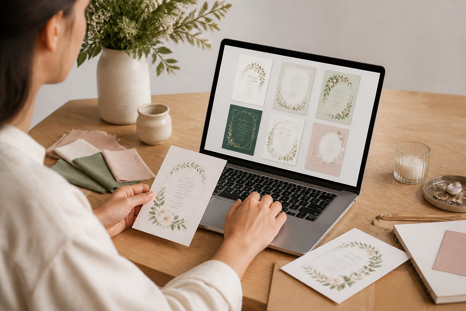
An observable checkpoint is whether people can immediately identify the event style, included files, and editing method from the preview. If they cannot, simplify the composition or improve the mockup. If interest is strong but shoppers ask for another size or color, adapt the product before expanding the collection.
Design the Invitation Around Usability
A wedding invitation must communicate essential information quickly. The couple’s names, event date, location, time, and response instructions should have a clear hierarchy. Decorative elements should support that information instead of competing with it. A design that looks impressive in a close-up preview may become difficult to read when printed at its actual size.
Start with the final format. Common invitation dimensions vary by market and printing service, so do not assume one size fits every buyer. Offer clearly labeled files when practical, and explain whether the template is intended for home printing, professional printing, or digital delivery. Include adequate margins and a safe area so text does not sit dangerously close to trimming edges.
Typography deserves particular care. Pair typefaces with distinct roles: perhaps a display face for names and a readable face for details. Limit the number of typefaces and maintain consistent capitalization, spacing, and alignment. Script fonts can provide elegance, but they should not carry long paragraphs or small essential information. Check every line at realistic scale, not only on a large monitor.
Color requires equal discipline. Screen colors may differ from printed results, especially across paper types and printers. Use palettes that preserve contrast and explain that physical output can vary. Dark text on a light background generally offers stronger readability than delicate low-contrast combinations. If a design intentionally uses pale tones, provide a version with improved contrast when possible.
Build a Complete, Editable File
A useful template includes more than a front design. Depending on the product, buyers may need a details card, RSVP card, information card, envelope insert, menu, place card, or matching thank-you note. Do not add components merely to increase the perceived quantity. Include pieces that logically serve the chosen wedding style and explain exactly what is included.
Editable text should remain easy to select and replace. Placeholder wording must be visibly different from final sample wording, so buyers understand what to change. Locking decorative elements can protect the composition, but excessive locking may frustrate customers. If the editing platform has limitations, design around them rather than assuming buyers will know technical workarounds.
Prepare files with careful naming. Labels such as “Invitation Front,” “RSVP Card,” and “Printing Guide” are more useful than vague names like “Final Version Two.” Test every shared link, download, and editable field from a buyer’s perspective. A fresh account or a colleague can reveal access problems that the creator overlooks.
The checkpoint is simple: ask someone unfamiliar with the design to open the files, replace the names, change the date, export a proof, and explain what they would do next. If that person pauses repeatedly, revise the instructions, layout, or file organization. Do not treat customer confusion as a minor inconvenience; it directly affects satisfaction and support time.

Select an Editing and Delivery Method Carefully
Templates may be delivered through a browser-based design platform, a downloadable document, or another editing system. Each option has benefits and limitations. Browser-based tools can reduce software barriers and make personalization approachable, but buyers may need an account or a compatible plan. Document templates can work offline, though fonts, image placement, and formatting may behave differently across devices.
Choose the method that matches the product’s promise. If the listing says “easy to edit,” the process should not require advanced design knowledge. If a design depends on paid fonts, premium graphics, or special software, disclose that before purchase. Never imply that a buyer receives exclusive ownership of platform assets or that a free account includes every feature.
Delivery instructions should be concise but complete. Explain how the buyer receives access, which parts can be changed, how to export a print-ready file, and where to seek help. Include a troubleshooting section covering common issues such as missing fonts, shifted text, incorrect paper size, and failed downloads. A short visual guide can be more effective than a dense paragraph.
Create a test order before publishing. Follow the delivery process as a customer would, preferably on a different device. Confirm that the files open, links work, and instructions match the current interface. Platforms change, so review the customer guide periodically. An outdated screenshot or button name can make an otherwise strong product feel unreliable.
Create Listings That Answer Buying Questions
A persuasive Etsy listing does not rely on attractive imagery alone. It answers the questions that stop a buyer from purchasing. State what the customer receives, how editing works, what is not included, and whether the product is instant digital delivery. Explain the design’s intended use without exaggerating its flexibility.
The first image should identify the invitation clearly. Additional images can show the full suite, close-up typography, customization steps, size information, color alternatives, and a realistic printed example. Avoid using mockups that hide the actual design. Buyers need enough information to judge readability and suitability.
Write titles and tags naturally around genuine attributes. Include the event type, style, format, and editing method where relevant. Do not fill the listing with repeated phrases or unrelated terms. A shopper searching for a botanical invitation should find a product that truly offers botanical design, not a generic template using a misleading label.
Descriptions should use short sections or bullets. Cover included items, dimensions, editing requirements, printing options, turnaround expectations, and restrictions on resale. Make the distinction between a template and a finished custom design unmistakable. Buyers often assume personalization services are included unless the listing says otherwise.
Use Mockups as Evidence, Not Decoration
Mockups help buyers imagine the invitation in context, but they must remain accurate. Show enough of the wording to demonstrate hierarchy and legibility. If photographs contain sample names or dates, label them as examples. Avoid presenting a physical paper texture as guaranteed when buyers may print on different stock.
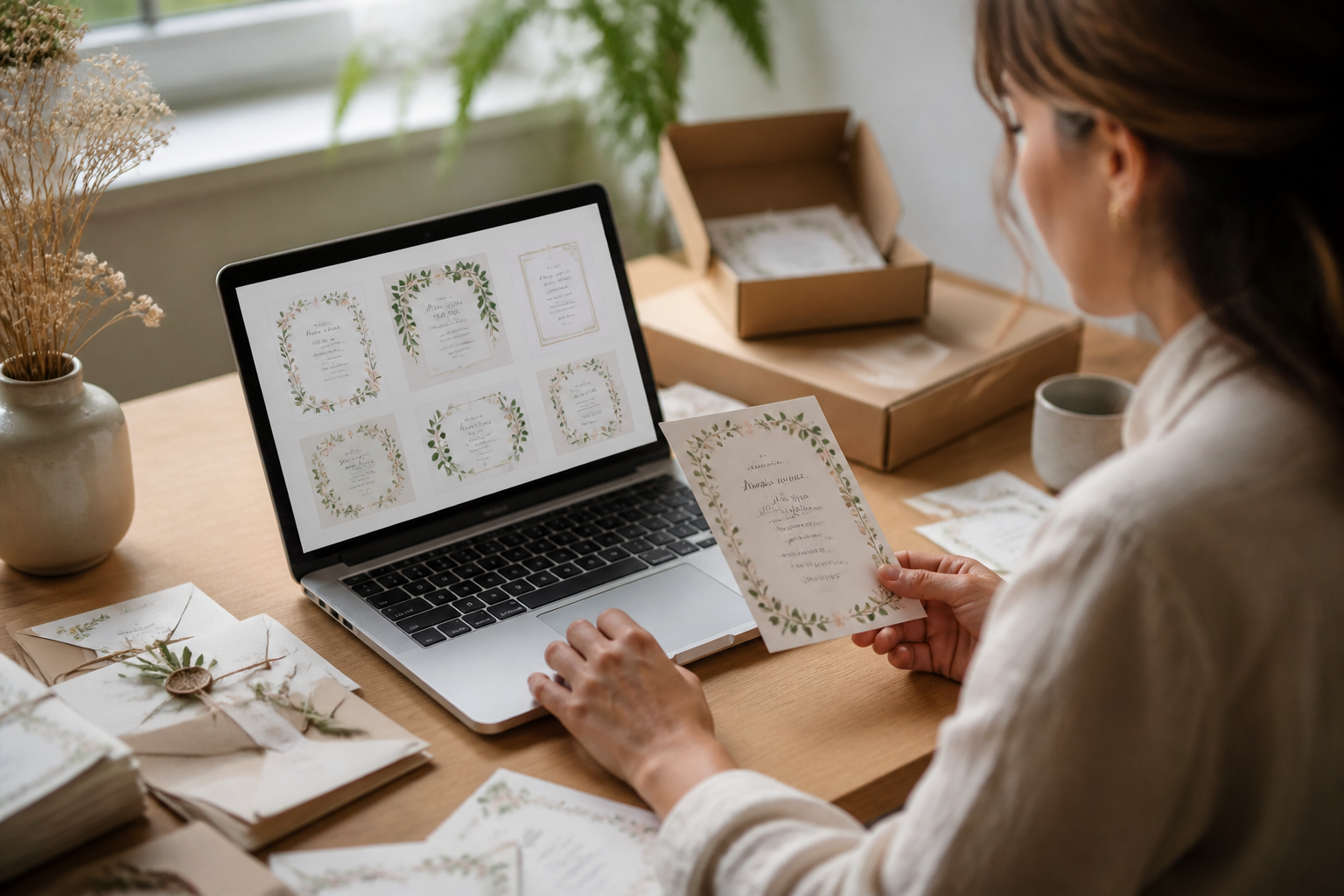
A useful image sequence might begin with the complete invitation, continue with the coordinated suite, then show an editing screen, and finish with a sizing or printing explanation. This sequence moves from emotional appeal to practical evidence. Make sure text remains readable on mobile screens, where many marketplace shoppers first encounter the listing.
Build a Product Line Instead of One Isolated File
A single template can test demand, but a coherent collection creates stronger reasons to return. Develop variations that preserve the same layout system while changing colors, motifs, wording arrangements, or paper formats. This approach saves design time and gives the shop a recognizable identity.
Consider offering coordinated items after the core invitation works well. Save-the-dates, RSVP cards, menus, seating charts, welcome signs, and thank-you cards can extend the same visual language. Bundles may appeal to buyers who want consistency, while individual products serve customers with smaller budgets or existing stationery.
Do not confuse more items with more value. A bundle becomes persuasive when its components solve related planning tasks and remain easy to personalize. Clearly list every included file. If a bundle is assembled from separate products, check that fonts, colors, margins, and wording conventions match across the set.
Create variations responsibly. Changing a color is not always enough to justify a separate product if the result is difficult to distinguish in search or confusing for customers. Conversely, meaningful differences in format or audience can warrant separate listings. Keep the buyer’s decision simple with clear names and preview images.
Price for Value, Support, and Sustainability
Digital templates have low delivery costs, but they are not costless to create or maintain. Account for design time, testing, mockup preparation, listing work, platform fees, promotions, software, customer support, and future updates. A very low price may attract attention, yet it can also signal limited quality or leave insufficient room for support.
Compare your offer with alternatives, not only competing templates. A buyer may consider a custom stationery designer, a local printer, a subscription design service, or a free editable sample. Your advantage might be a clear style, convenient personalization, coordinated files, or helpful instructions. State that value without claiming results you cannot guarantee.
Test pricing with a small range rather than changing it constantly. Observe whether shoppers click, favorite, purchase, or ask repeated questions. Low conversion may reflect weak previews or unclear information rather than price. If customers purchase but request extensive help, improve the product and instructions before assuming the price should rise.

Consider optional personalization as a separate service only if you can deliver it consistently. Define the number of revisions, information required, expected timing, and final file format. Keep custom work distinct from self-editable templates so buyers understand which experience they are choosing.
Protect Quality, Licensing, and Customer Trust
Use fonts, photographs, illustrations, and graphics according to their licenses. A commercial-use label does not automatically permit every form of redistribution, editing, or resale. Read the applicable terms and retain records of permissions. Do not include an asset in an editable template if the buyer might extract and reuse it outside the permitted conditions.
Create original layouts and illustrations where possible. Inspiration from common wedding aesthetics is normal, but copying a competitor’s distinctive arrangement, wording, mockup, or branding is not a sound business practice. A recognizable shop identity is more valuable than a quick imitation.
Set realistic expectations about printing. You can explain recommended file settings and paper considerations, but you cannot control every printer, monitor, paper stock, or local print shop. Avoid guarantees about exact color matching or flawless output. Encourage buyers to review a proof before ordering a large quantity.
Respect customer privacy. Wedding invitations may contain names, addresses, phone numbers, venue information, and event schedules. Do not share customer files or personalized previews publicly without permission. Remove private information from support screenshots and portfolio examples.
Provide Support Without Creating Confusion
Customer service is part of the product. Write a short welcome message that points buyers to the instructions and asks them to identify the specific problem if help is needed. A precise question, such as “the RSVP card exports with a missing line,” is easier to solve than a general complaint that the template does not work.
Prepare answers for predictable issues. Common topics include changing fonts, replacing photos, adjusting text that wraps, exporting correctly, printing at home, and accessing files on a mobile device. Explain what the template can do and what requires a different design method. Clear boundaries are kinder than vague promises.
When a buyer reports a problem, reproduce it if possible. Check whether the issue comes from the template, platform, device, printer, or customer action. Offer the simplest safe adjustment first. If the problem reveals a broader weakness, update the instructions or file rather than answering the same question indefinitely.
Monitor reviews for patterns, not isolated emotional reactions. Repeated comments about unclear access, hard-to-read text, or missing sizes indicate a product issue. Respond professionally and avoid revealing private details. A thoughtful correction can protect trust more effectively than a defensive explanation.
Measure Performance and Improve Deliberately
Track basic signals for each listing: views, favorites, orders, conversion behavior, customer questions, refunds, and review themes. These measures do not explain everything, but they help separate visibility problems from product problems. Many views with few purchases may indicate weak differentiation, unclear value, or unsuitable images. Few views may suggest poor positioning or limited demand.
Change one major variable at a time when possible. Improve the first image, clarify the editing method, add a missing size, or revise the title. Allow enough time to observe the effect before making another substantial change. Constantly changing everything prevents useful learning.
Use customer language responsibly. Questions can reveal phrases buyers naturally use, but do not copy private messages into listings or exaggerate demand. Turn recurring confusion into a clearer FAQ, guide, or preview. Every improvement should reduce friction without making the listing longer than necessary.
Expand only after the core product is dependable. New designs are exciting, but unresolved access or support problems multiply as the catalog grows. A smaller shop with accurate listings and reliable files can build a stronger foundation than a large shop filled with inconsistent products.
Common Mistakes to Avoid
One frequent mistake is designing for the seller instead of the buyer. Creators may prioritize intricate decoration, unusual formats, or personal preferences while overlooking editing speed and readability. Ask whether the customer can complete the task confidently, not whether the design displays technical skill.
Another mistake is hiding limitations. If the template requires a specific account, paid feature, or separate font, say so before purchase. If wording cannot be edited because it is part of an image, make that clear. Transparency may reduce some impulse purchases, but it prevents avoidable dissatisfaction.
Sellers also underestimate mobile viewing. Tiny text, crowded previews, and low-contrast screenshots may look acceptable on a large screen but fail in a marketplace feed. Test listing images at reduced size and make the primary message understandable quickly.
Finally, avoid launching too many styles at once. A focused collection makes quality control, branding, and customer support easier. Expand when evidence shows that buyers want another color, format, or coordinated item.
Frequently Asked Questions
Are Etsy wedding invitation templates profitable?
They can be viable because digital delivery reduces physical fulfillment, but profitability depends on design quality, discoverability, pricing, licensing, and support. No template is guaranteed to sell. A focused audience and dependable customer experience generally provide a stronger foundation than a large collection of generic designs.
What should a template include?
That depends on the product promise. At minimum, identify the editable invitation file, format, dimensions, and delivery method. A suite may add RSVP, details, or information cards. Include only components that are useful, clearly labeled, and tested.
Should sellers offer editable templates or custom invitations?
Editable templates suit buyers who want control and quick personalization. Custom invitations suit buyers who prefer assistance. Either model can work, but the listing must distinguish self-editing from seller-provided personalization. Offering both can broaden the audience, although custom work requires more scheduling and communication.
Which file format is best?
There is no universal best format. Choose the method that supports the intended buyer and preserves layout reliably. Explain software requirements, account needs, export settings, and limitations. Test the entire process before publishing rather than selecting a format solely because it is popular.
How many designs should a new shop launch?
A small, coherent selection is usually easier to test and maintain than an oversized catalog. Launch enough related designs to learn which style and audience respond, then expand using evidence. Quality, consistency, and accurate information matter more than an arbitrary item count.
How can sellers reduce support requests?
Use plain instructions, labeled files, accurate previews, and a short troubleshooting guide. Demonstrate the editing process and explain what cannot be changed. Test the buyer journey yourself. When the same question appears repeatedly, improve the product or guide instead of relying only on saved replies.
What legal issues deserve attention?
Check permissions for fonts, graphics, photographs, and platform assets. Review rules concerning commercial use, redistribution, and incorporation into editable products. Protect customer information and avoid copying distinctive competitor work. When a legal question is specific or consequential, seek qualified advice rather than relying on assumptions.
Conclusion
Etsy wedding invitation templates are a practical product idea when they are treated as useful tools rather than decorative downloads. The opportunity rests on a clear audience, readable design, reliable editing, honest listings, careful licensing, and responsive support. Start with one wedding style and a small collection, validate the concept through real questions, and test every file from the customer’s perspective.
Design around the complete task: choosing wording, editing details, exporting correctly, reviewing a proof, and sending the invitation to print or guests. Show the product accurately, explain limitations before purchase, and use feedback to improve the parts that create friction. Then expand into coordinated stationery only after the core experience is dependable.
A persuasive template does not promise a perfect wedding. It gives couples a well-organized starting point that saves time, supports confident decisions, and reflects their celebration. For the seller, that combination of focused design and practical delivery creates a sustainable direction for building a thoughtful Etsy shop.