

Start With Etsy’s Image Requirements
Creating Etsy listing image templates in Canva is easiest when you treat the template as a reusable selling system rather than a decorative collage. Your goal is to present an item clearly, answer common buyer questions, and maintain a recognizable visual identity across listings. A strong template saves time, reduces inconsistent formatting, and helps shoppers understand what they are considering before they read the description.
Before opening Canva, review Etsy’s current seller guidance for image dimensions, file formats, image quantity, and presentation rules. Platform requirements can change, so use Etsy’s own help resources as the final authority. In general, prepare high-quality images with a consistent orientation, leave enough space for cropping, and make the first image especially clear because it commonly becomes the main visual representation of the listing.
Templates should support photography, not replace it. If you sell a physical product, include an accurate product photograph or a carefully prepared mockup. If you sell a digital item, show the actual files, pages, or design in a way that communicates what the customer receives. Avoid adding claims, features, colors, sizes, or included items that the product does not genuinely provide.
Plan the Information Buyers Need
A listing image sequence works best when each image has a distinct job. Do not design ten attractive graphics that repeat the same message. Instead, plan a visual path from recognition to confidence.
The first image should identify the product immediately. Use a clean photograph, mockup, or product-centered composition. Keep background distractions low and make the item large enough to understand in a small thumbnail.
The second image can explain the product’s main benefit or show it in use. For example, a printable planner might appear on a tablet, while a handmade mug might be shown in a realistic kitchen setting. Context helps shoppers imagine ownership, but it should never obscure the product.
The third image may communicate dimensions, materials, colors, file types, or compatibility. Present technical information with short labels and a simple diagram. Buyers appreciate specifics because precise information reduces uncertainty and prevents avoidable misunderstandings.
Additional images can explain what is included, demonstrate scale, show variations, answer care questions, or provide instructions for digital downloads. If an image carries several facts, organize them into small groups rather than compressing everything into one crowded graphic.
Write a short plan before designing. For instance:

- Product hero image.
- Lifestyle or usage image.
- Size and detail information.
- Contents or variations.
- Process, care, or setup guidance.
- Final reassurance or callout.
This outline is flexible, but it gives every slide a purpose and makes template creation much faster.
Set Up a Reusable Canva File
Create a new Canva design using a custom size that matches your chosen Etsy image format. If you are uncertain about the correct dimensions, check Etsy’s current documentation before building the file. A template created at an unsuitable size may look fine in Canva but become blurry, cropped, or awkward after upload.
Name the file clearly, such as “Etsy Listing Template—Brand Name,” and organize pages by function. You might create pages titled Hero, Lifestyle, Details, Dimensions, Included, Variations, and Instructions. These labels make duplication easier when you return to the file weeks later.
Establish a small design system before adding text. Choose one background color, one primary text color, one accent color, and perhaps one supporting neutral. Select no more than two complementary fonts. A readable sans-serif font often works well for information, while a restrained display font can add personality to a heading. Test every font at a reduced preview size; text that looks elegant when enlarged may become unreadable in Etsy’s thumbnail view.
Define margins and alignment guides. Keep important words and product edges away from the perimeter because different placements or cropping situations can make edge content vulnerable. Use Canva’s rulers, guides, and position controls rather than relying only on visual guessing. Consistent margins are one of the simplest ways to make a collection look professionally planned.
Build Master Pages and Flexible Zones
Instead of designing each listing from a blank page, create master layouts with replaceable zones. One layout might have a large product area on the left and a text panel on the right. Another might use a centered product image with a small information strip underneath. A third could reserve space for a diagram or a grid of variations.
Keep those zones flexible. Product photos have different proportions, backgrounds, and visual weights. If a frame is too rigid, users may stretch images unnaturally or cover important details. Prefer crop controls, transparent overlays, and generous spaces that accommodate modest variation.
Use consistent naming in your page titles and, where helpful, add subtle internal notes that explain what belongs in each area. Remove those notes before exporting a finished listing image. Group related elements so they can be moved together, but avoid locking every object while still editing. A template should be controlled enough to protect consistency and open enough to support real products.
Design the First Image for Immediate Clarity
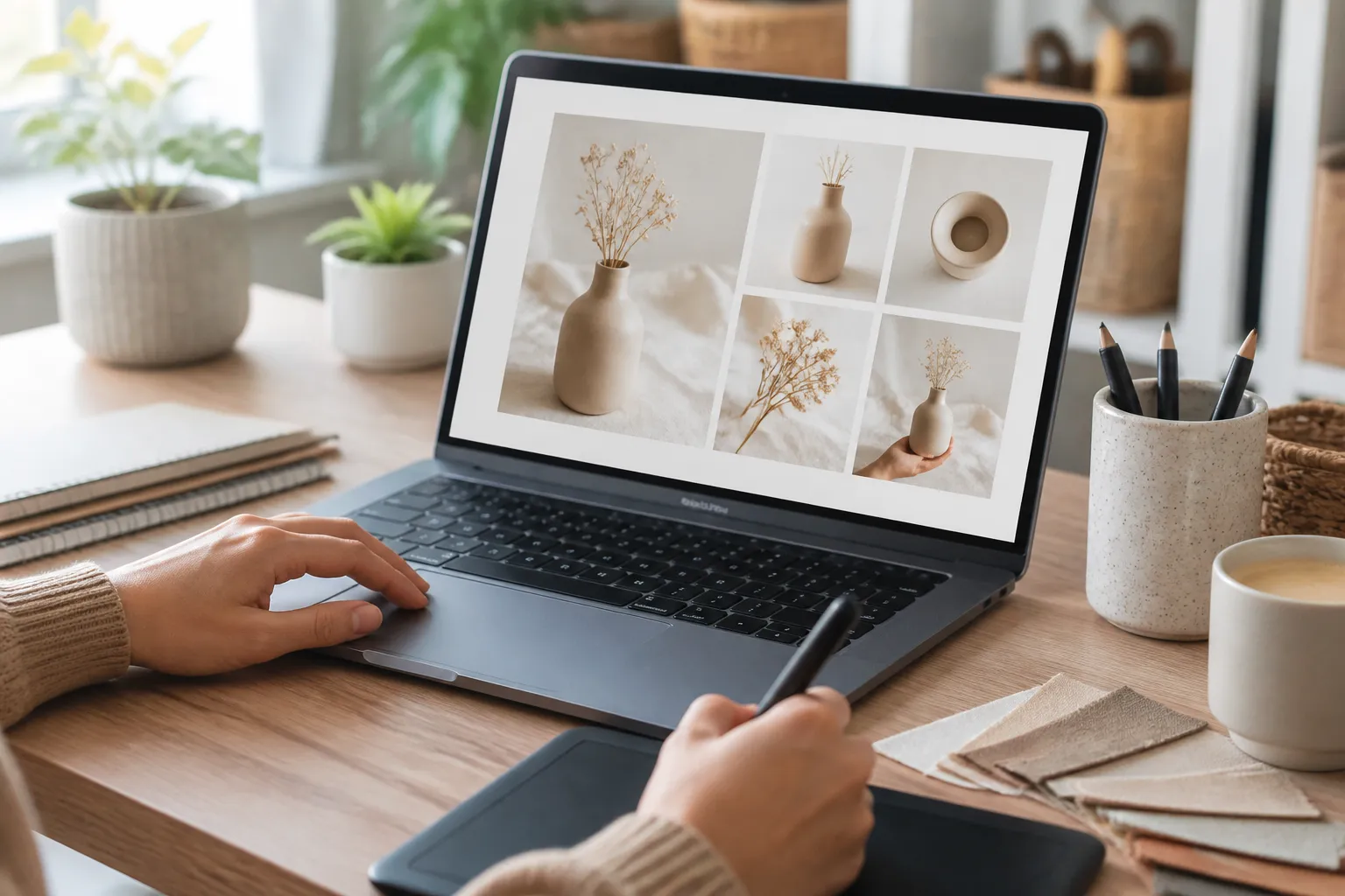
The first image deserves more attention than any other page because shoppers often encounter it in search results, category browsing, or promotional placements. Design it to answer the basic question: What is being sold?
Place the product at the visual center of attention. Use a clean background, natural lighting, and enough contrast between the item and its surroundings. If you add text, keep it brief and secondary. A phrase such as “Printable Meal Planner” may clarify the offering, but a long paragraph will compete with the product.
Do not turn the hero image into a crowded advertisement. Too many badges, decorative stickers, arrows, and promotional phrases can make a listing look uncertain or difficult to understand. Decorative elements should reinforce the product’s character, not conceal its shape or reduce its perceived quality.
For products with important variation, choose a representative version and explain the available options in another image. Showing multiple products in the first image can confuse buyers about what one purchase includes. If a photograph contains props, make sure the listing explains whether those props are included.
Create Informational Slides That Remain Readable
Informational images are valuable because they answer questions before a shopper sends a message. However, they only work when visitors can read them quickly. Use a strong hierarchy: a clear heading, a short explanation, and supporting labels or icons.
For dimensions, show a simple product outline with labeled measurements. For digital files, list formats, page counts, software requirements, or access instructions only when those details are accurate for the specific item. For a bundle, display the components separately and label them clearly.
Use plain language. “Includes twelve editable pages” is more useful than “A complete creative productivity experience.” Concrete wording helps buyers compare options and understand value. Avoid absolute claims such as “perfect for everyone” or “the only planner you need.” Persuasion is stronger when it is specific and credible.
Choose icons carefully. A small file icon, ruler, envelope, or care symbol can improve scanning, but unfamiliar symbols create more work. Pair important icons with words, especially when the information affects purchasing decisions.

Use Mockups Without Misrepresenting the Product
Mockups can make a digital product easier to visualize, but they must not imply features that are absent. If a template is shown on a tablet, clarify whether the purchase includes a digital file, a physical device, or both. If a frame, desk, plant, or accessory appears in a scene, ensure buyers can distinguish decoration from included contents.
For handmade products, lifestyle scenes should show realistic scale and use. Avoid editing colors so aggressively that the displayed item no longer resembles the shipped product. Monitor brightness, contrast, and saturation across the complete image set. A consistent look is useful, but accuracy remains more important than aesthetic uniformity.
Canva’s frames, background tools, transparency controls, and alignment features can help produce polished mockups. Use them carefully. A product with awkward edges may need a better source photograph rather than heavier editing. Templates cannot correct poor lighting, missing details, or inaccurate representation.
Add Brand Consistency Without Losing Product Focus
A recognizable visual identity encourages shoppers to understand that several listings belong to the same shop. Apply recurring choices such as a color palette, font pairing, margin system, image treatment, or small logo placement. Consistency should make browsing easier, not make every image look identical.
Place branding where it will not compete with the product. A modest logo or shop name in a corner can be enough. Oversized logos reduce available space and may make the image feel like an advertisement rather than useful listing information.
Create variations inside the same Canva file. A light-background version may suit dark products, while a dark-background version may improve contrast for pale items. A text-heavy information page may need a shorter alternative for products with limited details. Planning these options prevents rushed edits later.
Use Canva’s duplicate-page function to preserve the original. Label working copies with the listing name and date, then keep the master untouched. This simple habit protects your system when an experiment produces unwanted changes.
Make the Template Easy to Customize
A template succeeds only if you can update it accurately. Replace sample text with clear placeholder wording, such as “PRODUCT NAME,” “SIZE,” or “WHAT’S INCLUDED.” Generic filler like “Add text here” may not remind you what information belongs in that space.

Use text boxes large enough to accommodate longer product names, but test the maximum likely length. If a heading wraps into three lines, it may shift nearby elements or create visual imbalance. Design alternate layouts for short and long titles instead of shrinking the font until it becomes difficult to read.
Prepare photo areas with realistic examples. A blank frame does not reveal whether the composition works with a square item, a portrait product, or a wide scene. Test the template using several representative photographs before calling it finished. This process exposes alignment problems, awkward crops, and insufficient contrast.
Add optional elements as separate groups. For example, keep a sale badge, “digital download” label, or variation block easy to hide. Optional components are more useful than a single rigid layout because different products require different facts.
Export and Upload Carefully
When the design is complete, inspect every page at full size and at thumbnail size. Look for spelling errors, accidental sample text, inconsistent capitalization, misaligned objects, clipped measurements, and product details hidden by overlays. Confirm that each claim matches the listing description and actual item.
Export using a high-quality image format supported by Etsy. Canva presents several download choices, so select the option that preserves sufficient clarity without creating an unnecessarily large file. Open the exported files outside Canva and inspect them again. Exporting can reveal differences in transparency, spacing, or color.
Use descriptive file names such as “shop-product-hero” and “shop-product-dimensions.” Clear names reduce mistakes when many listings are being uploaded. Keep an organized folder containing the editable Canva file, original photographs, exported images, and any version notes.
After uploading, review the listing as a shopper would. Check the image order, crop, readability, and mobile appearance. A composition that looks balanced on a desktop monitor may feel crowded on a phone. If important information becomes tiny, move it into a simpler image or reduce the amount of text.
Test the Template Against Real Listings
Do not evaluate a template only by how attractive the blank design looks. Apply it to several products with different colors, sizes, and image styles. A useful template should remain understandable when the product changes.

Compare the first image with nearby visual competition without copying another seller’s design. Ask whether your product is identifiable at a glance, whether the background supports it, and whether the image communicates a meaningful reason to continue viewing. Then inspect the information pages for clarity and factual accuracy.
Invite a colleague or trusted customer-facing person to answer three questions: What do you think is being sold? What do you think is included? What question remains unanswered? Their responses can expose assumptions that feel obvious to the designer but are not obvious to a new shopper.
Revise based on recurring confusion, not on every personal preference. If several people misread a size, enlarge the measurement. If they cannot tell which items belong to a bundle, separate the components and labels. This approach improves communication more reliably than adding decoration.
Common Mistakes to Avoid
One frequent mistake is using a template that places branding above product visibility. A template should support the item’s shape, texture, and function. Another is forcing every listing into the same number of images. Some products need a care guide, while others need a file-format explanation; let the product determine the sequence.
Avoid tiny text, low-contrast color combinations, excessive shadows, and decorative patterns behind detailed products. Avoid relying on color alone to communicate variations because some shoppers may have difficulty distinguishing hues. Add names, labels, or visual differences.
Do not make unsupported urgency or performance claims. Phrases such as “best,” “guaranteed,” or “instant results” may create expectations that the product cannot meet. Clear, honest persuasion builds stronger confidence than exaggerated language.
Finally, avoid editing the product beyond recognition. Buyers need a realistic basis for their decision. Accurate photographs, transparent mockups, and precise labels protect both the customer experience and your shop’s credibility.
FAQ
What Canva size should I use for Etsy listing images?
Use the image dimensions and file guidance currently published by Etsy. Requirements and recommendations can change, and the correct choice may depend on how you want the image displayed. Build the Canva template at that size, then export and inspect the result before applying it to every listing. Leave comfortable margins so important details remain safe if cropping occurs.
How many templates should an Etsy shop have?
A small shop can begin with three or four core layouts: a hero image, an informational page, a dimensions or contents page, and a lifestyle or usage page. Add specialized layouts only when products genuinely require them. Too many options slow production and can weaken visual consistency. The goal is a flexible system, not a large library that nobody maintains.
Should every Etsy image contain text?
No. Product photographs often communicate more effectively without text. Add words when they clarify dimensions, contents, compatibility, variations, or a key benefit. Keep text concise and readable. If an image is already self-explanatory, additional wording may distract from the product rather than improve understanding.
Can I use Canva mockups for physical products?
You can use mockups when they represent the item accurately and comply with the applicable platform and licensing terms. Check the source of any stock photograph, graphic, or mockup element and confirm that your intended commercial use is permitted. Do not let a mockup imply that props, devices, or accessories are included if they are not.
How can I make digital products clear?
Show the actual pages, screens, or file types customers will receive. Identify whether files are editable, printable, layered, or compatible with particular software only when that information is true. Display several representative pages rather than a tiny collage. A contents image and a simple usage image can answer practical questions before purchase.
What should I do if my product photos have different backgrounds?
You can use consistent cropping, border treatment, or background color to create cohesion, but do not sacrifice accurate appearance. If backgrounds are distracting, improve the original photography or use careful editing. Check edges closely, especially around hair, fibers, transparent objects, and fine details. A slightly varied but honest photo set is preferable to an artificial result.
How often should I update my templates?
Review templates whenever Etsy changes relevant guidance, your branding changes, or repeated customer questions reveal missing information. You do not need to redesign everything for every seasonal trend. Improve the system when a change makes listings clearer, faster to maintain, or more accurate. Keep dated backups so you can restore a dependable version if needed.
Conclusion
A Canva template becomes valuable when it turns clear product information into a repeatable listing process. Start with Etsy’s current technical guidance, plan each image around a buyer question, and build layouts with flexible photo and text zones. Give the first image immediate clarity, use later images for useful specifics, and preserve accuracy in every mockup and claim.
Create a small visual system rather than a collection of unrelated graphics. Test it with real products, inspect exported files, and review the uploaded listing on a smaller screen. When shoppers can identify the item, understand what they receive, judge its scale, and find answers without effort, your images do more than look polished: they support informed purchasing and make your shop easier to trust.